Robert Wederquist
UX Design + Scrum
Train Schedule
Pacific Northwest College of Art
Project method: Self-design
Goals
Twenty years after I graduated from college, I went back. And I'm glad I did.
Like many people, the things I studied in my youth didn't align with where I wound up professionally. I was an English major who became a journalist and print designer, and then a web designer, and then a UX designer. I was creating digital designs at work every day, but I realized that I'd never studied graphic design as a craft.
Thus, I enrolled at the Pacific Northwest College of Art in Portland to take design classes in pursuit of a postgraduate Studio Certificate in Graphic Design. It was a great opportunity to expand my skills and experience, and well worth my nights and weekends.
One of the features of taking design classes is the opportunity to work on fictional products. Not that actual products are not interesting, but inventing a company or venture, crafting a business summary, and then creating marketing assets is freeing and explorative.
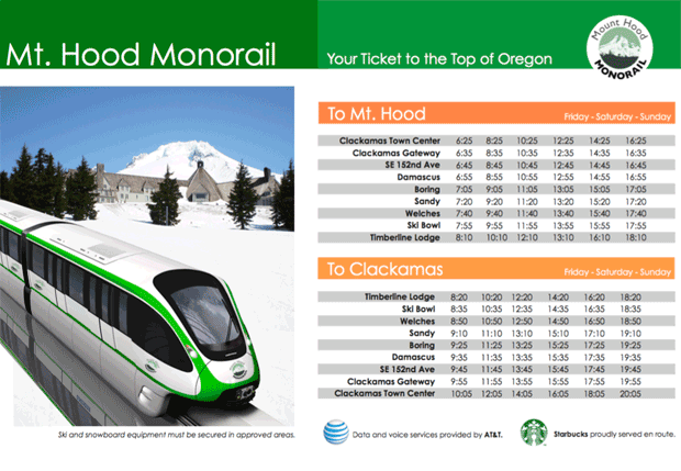
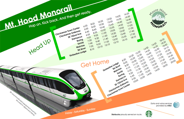
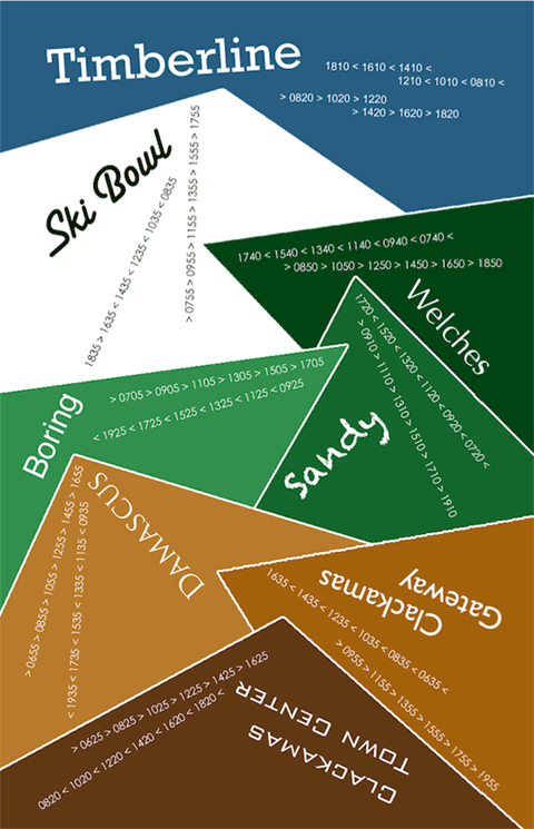
For this project — in PNCA's Typography I class — each student was asked to design a train schedule, first on a grid and then “break the grid.” A third design was also meant to break the grid, but it had to demonstrate craft by hand — not simply within Adobe Suite.
Process
Being an avid skier who drives to Timberline during the ski season, it wasn’t hard for me to envision a mass-transit option to the ski lodge at Timberline. I actually enjoy the drive to the mountain, but going by train would be pretty fantastic. Using a simple map, I plotted out the imaginary monorail line and its stations, accounting for time, in addition to determining where a side-track would be necessary when the two trains pass each other en route. The numbers aren’t lorem ipsum — in theory, the schedule works.
I used my own photo of Timberline Lodge and Mt. Hood for the background, along with a found photo of a monorail train.
Deliverable
Students were asked to design a grid. Here it is. Clear and direct. Useful, even. But maybe a bit boring.
We then were asked to “break the grid,” using the same content. I like this one better!
Finally. we were asked to create a second “break the grid” design, which had to be done by hand. For this, I decided to mix typography with a landscape pastiche. The final product comprises textured papers, giving the schedule a distinctive, tactile quality. But even with these touches, it’s still meaningful and usable as a train schedule. Here's the Illustrator design I used as a template:
Results
No profits or metrics to report on this one, and I’m pretty confident that a monorail won’t be built from Portland to Timberline Lodge anytime soon. However, I did get an ‘A’ on the project (and the class).
Insights
Design is fun, especially when given the opportunity to iterate and explore. What started as a simple set of tasks — create a table, craft a schedule — resulted, by the end of the project, in assembling a collage by hand with various textured papers I’d selected from a local craft store. Not too bad for a web designer.


